Client : Third Wave Coffee

Third Wave Coffee: Website

OVERVIEW

As Third Wave Coffee rapidly expanded across the country, their website needed a facelift to reflect the same digitally. They brought us on board to refresh the content and design of their website.

OBJECTIVE

To create a website for Third Wave Coffee that could anchor their nationwide physical presence, showcase their FMCG products and act as an overall window to the brand.

Website design, in collaboration with Tonic Design House.

See the full website here.

COLLABORATORS

Tonic Design Studio

Coffee Made Easy

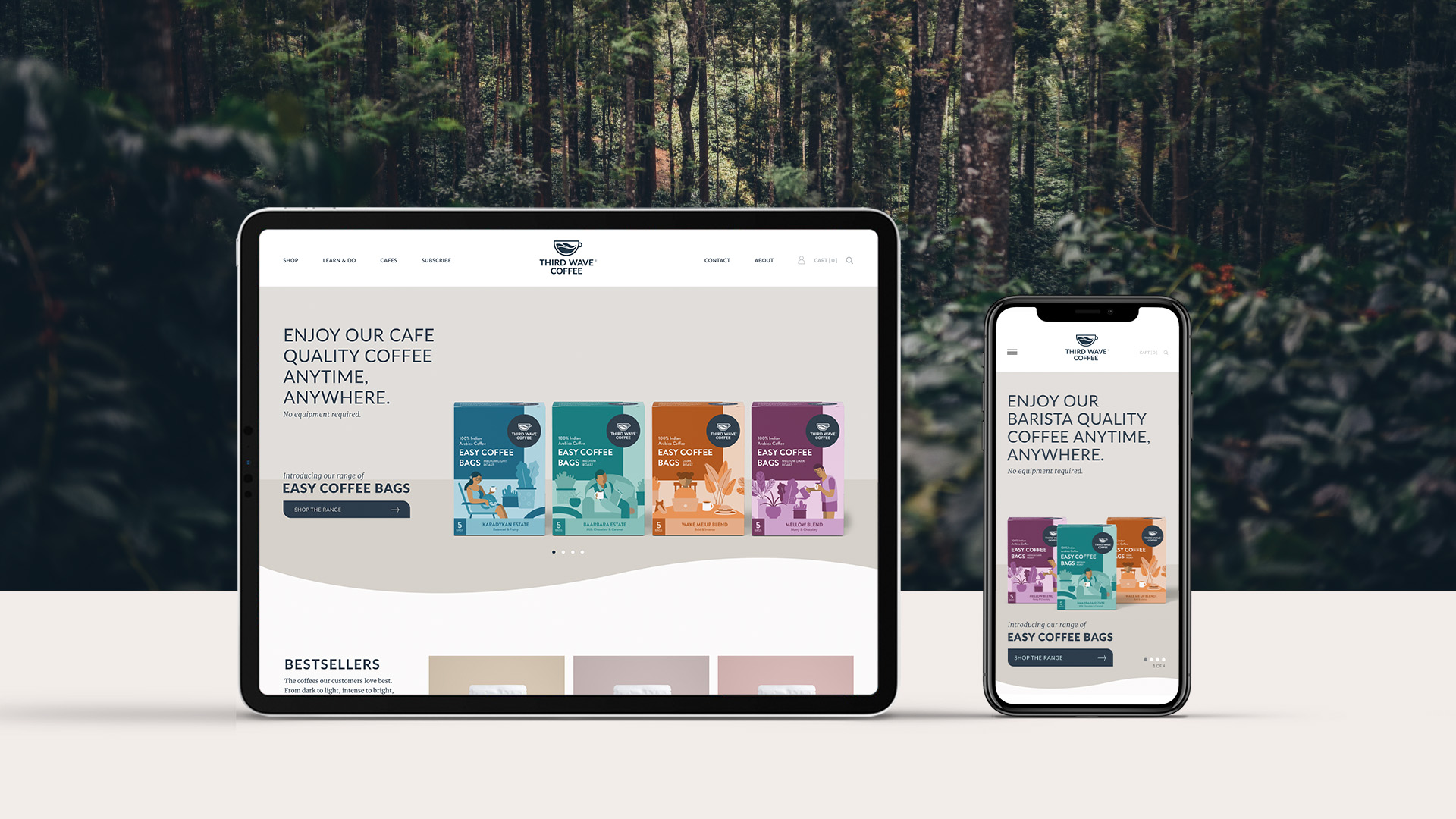
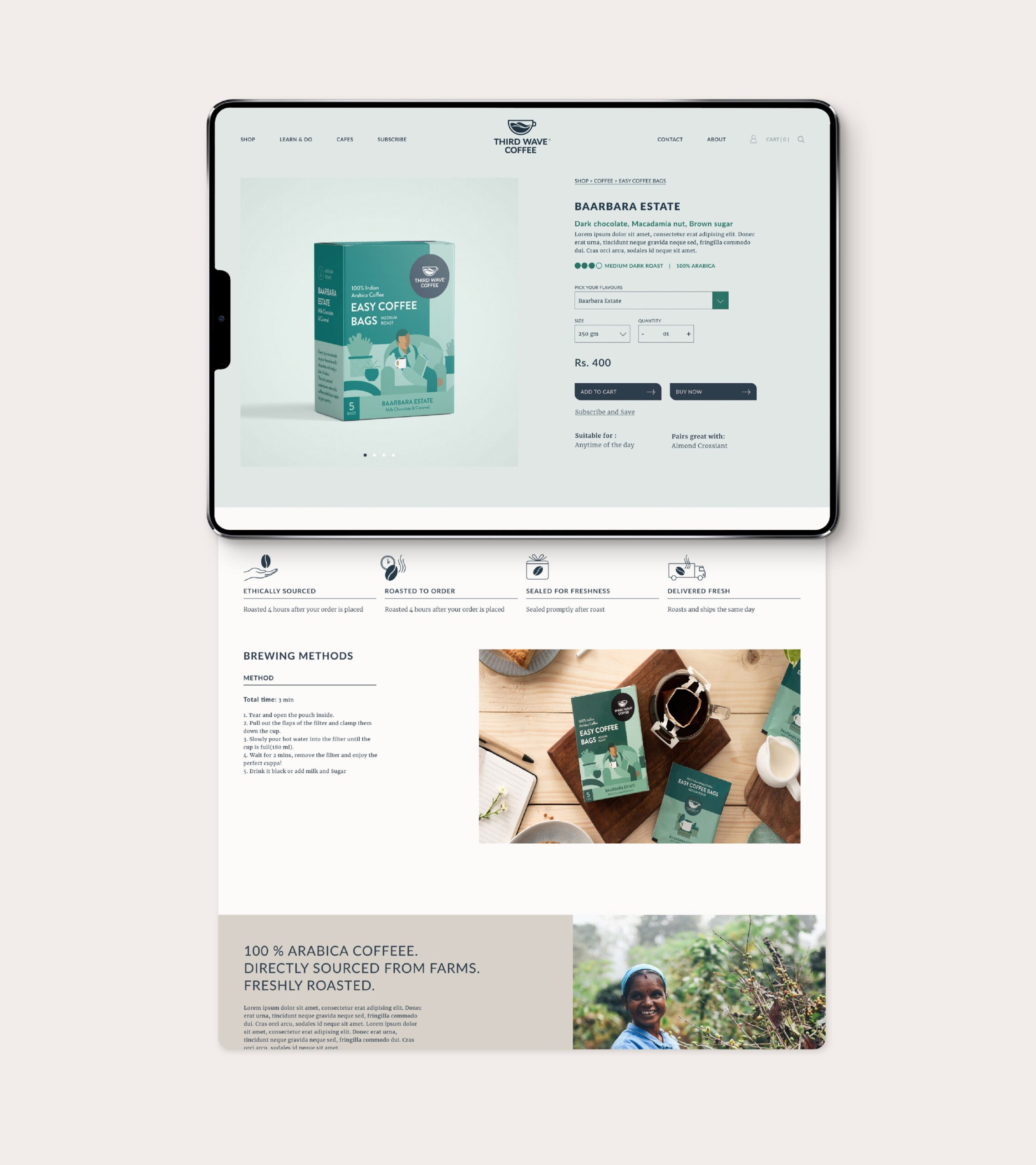
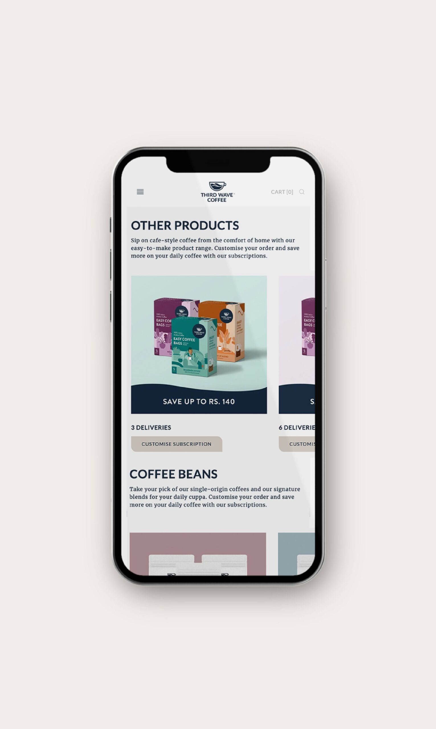
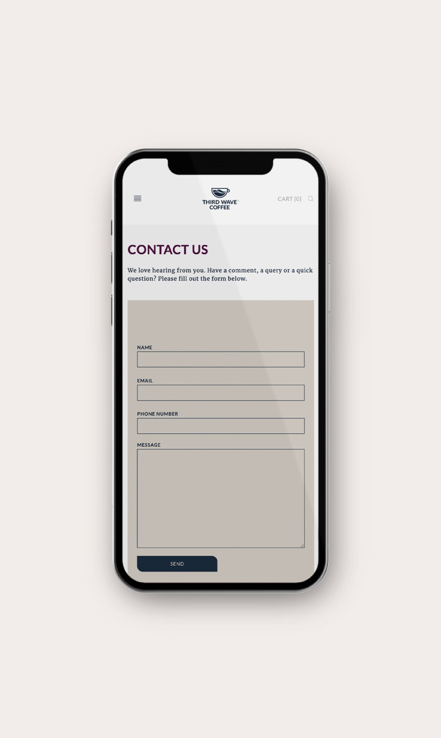
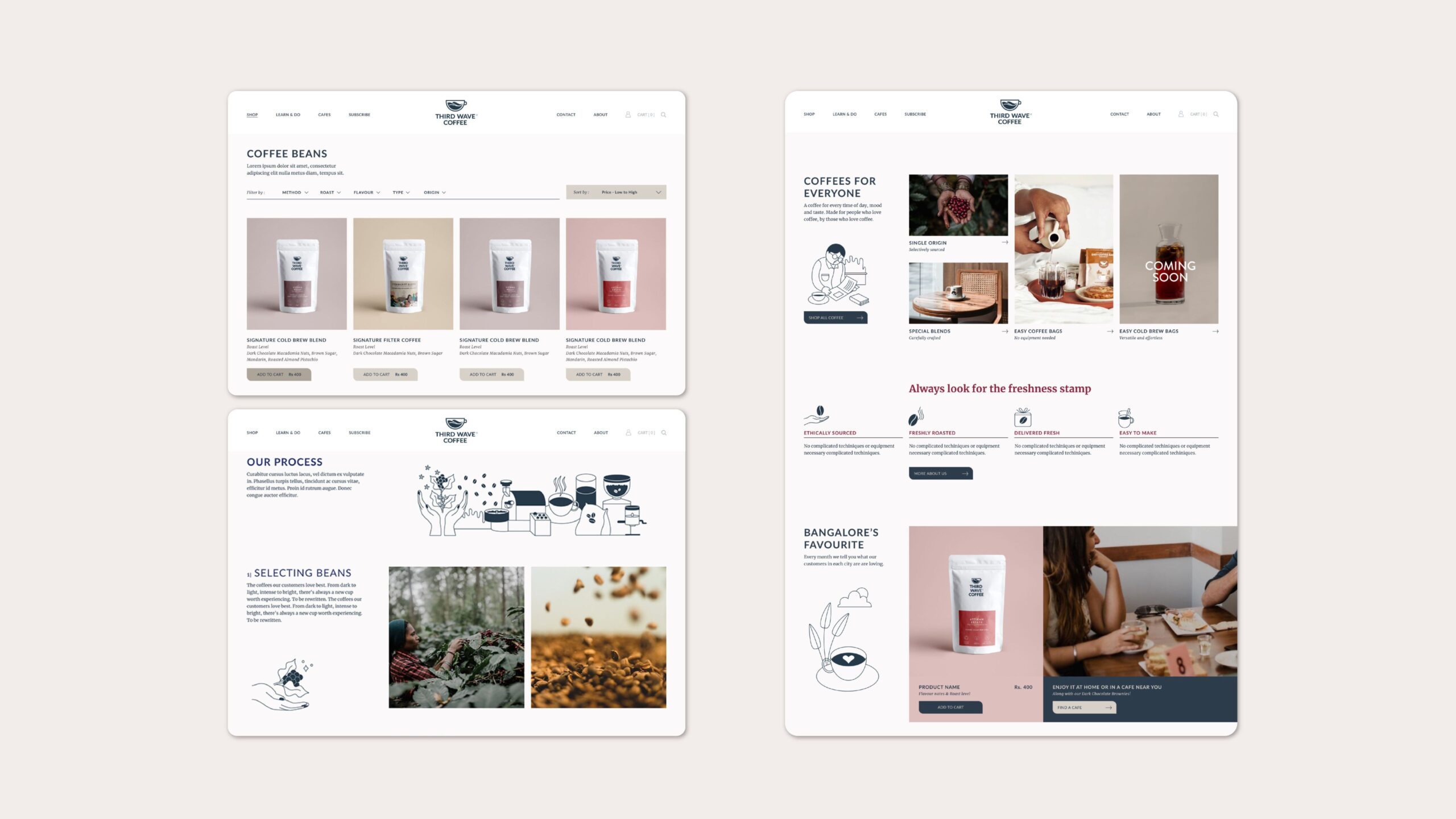
The world of specialty coffee runs the risk of being confusing and technical, so we ensured that both the website and the products were easy to navigate for amateurs and aficionados alike. Sections like the coffee quiz, coffee for everyone and brewing guides were included to put even first-time coffee drinkers at ease. The colour palette and typography were in line with the brand language and worked cohesively, resulting in a well-rounded consumer touchpoint. The dynamic website flow worked seamlessly across all screens and devices.


Capturing the Cafe

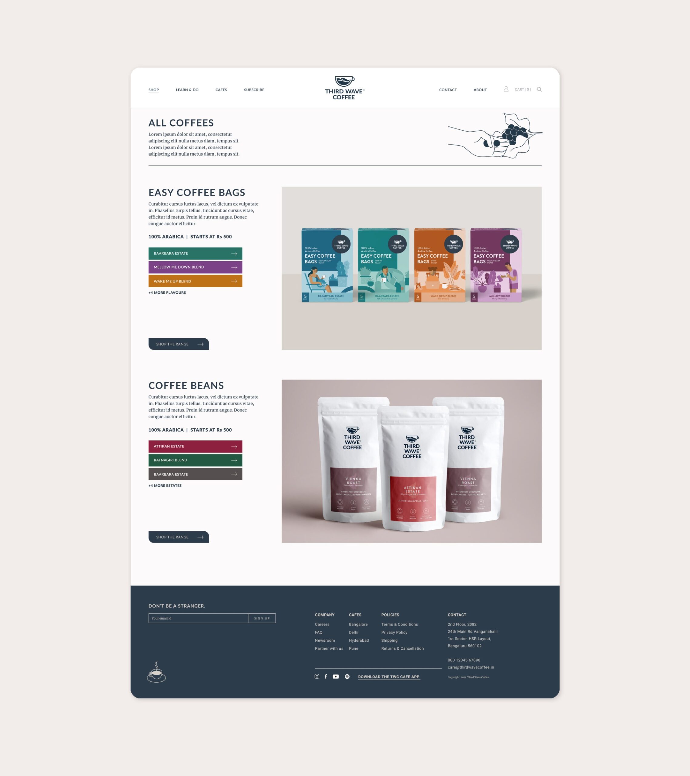
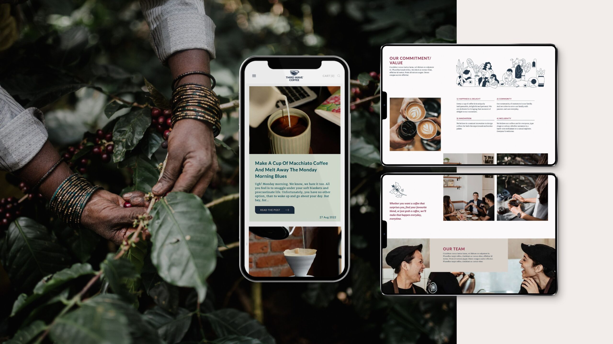
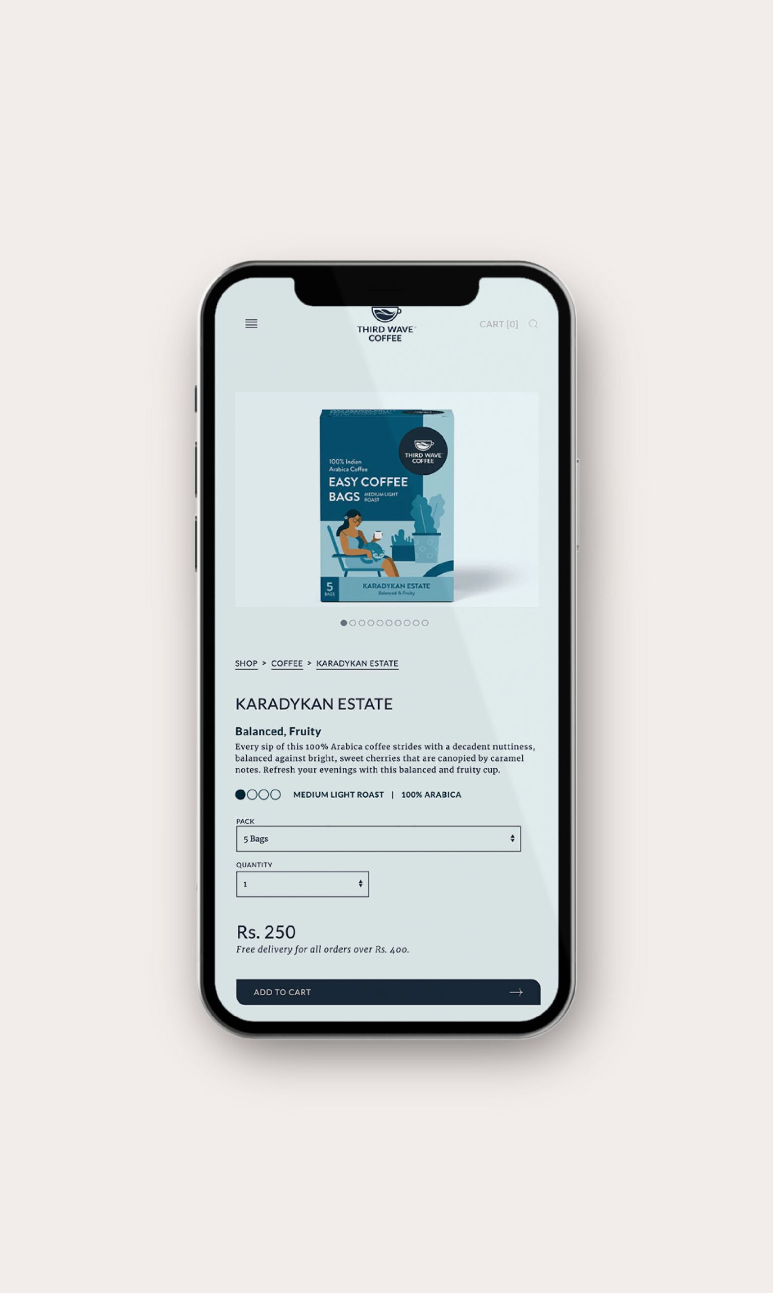
Their positioning statement—‘building communities over coffee’—was brought to life with brand illustrations peppered throughout the website. Our website copy helped clearly bring out the brand ethos and overall vibe. The shop pages were simple, effective and well-categorised. Descriptions for the products were worded to be rich and evocative, boosting interest. We used photography to further the feeling of community, camaraderie and care that the Third Wave Coffee brand stands for. All in all, our website felt just like a good Third Wave brew—fresh, clean and delightful.

Viewed best on Portrait mode