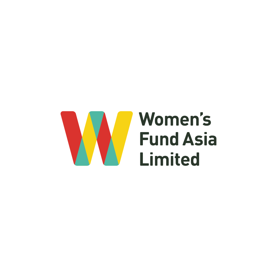
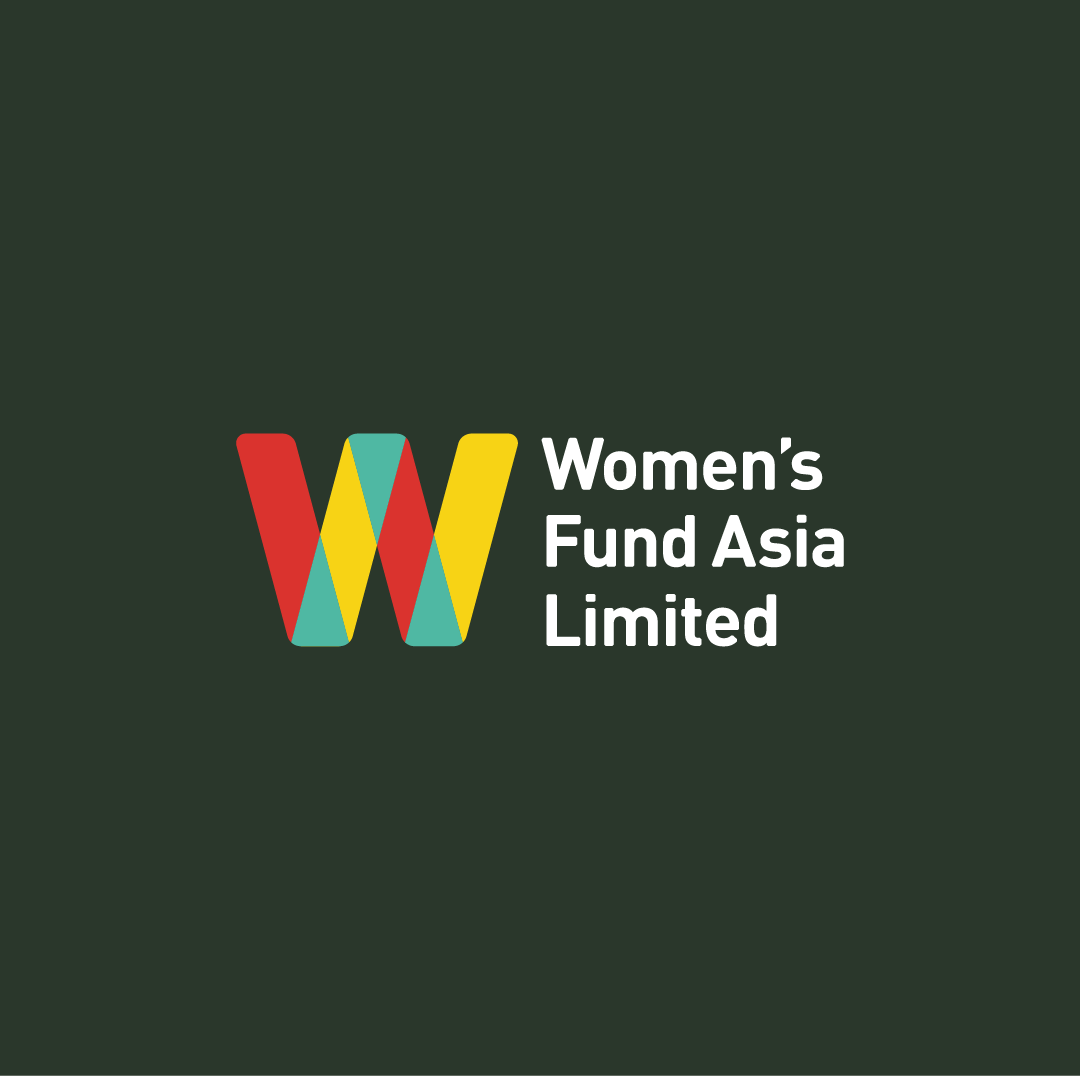
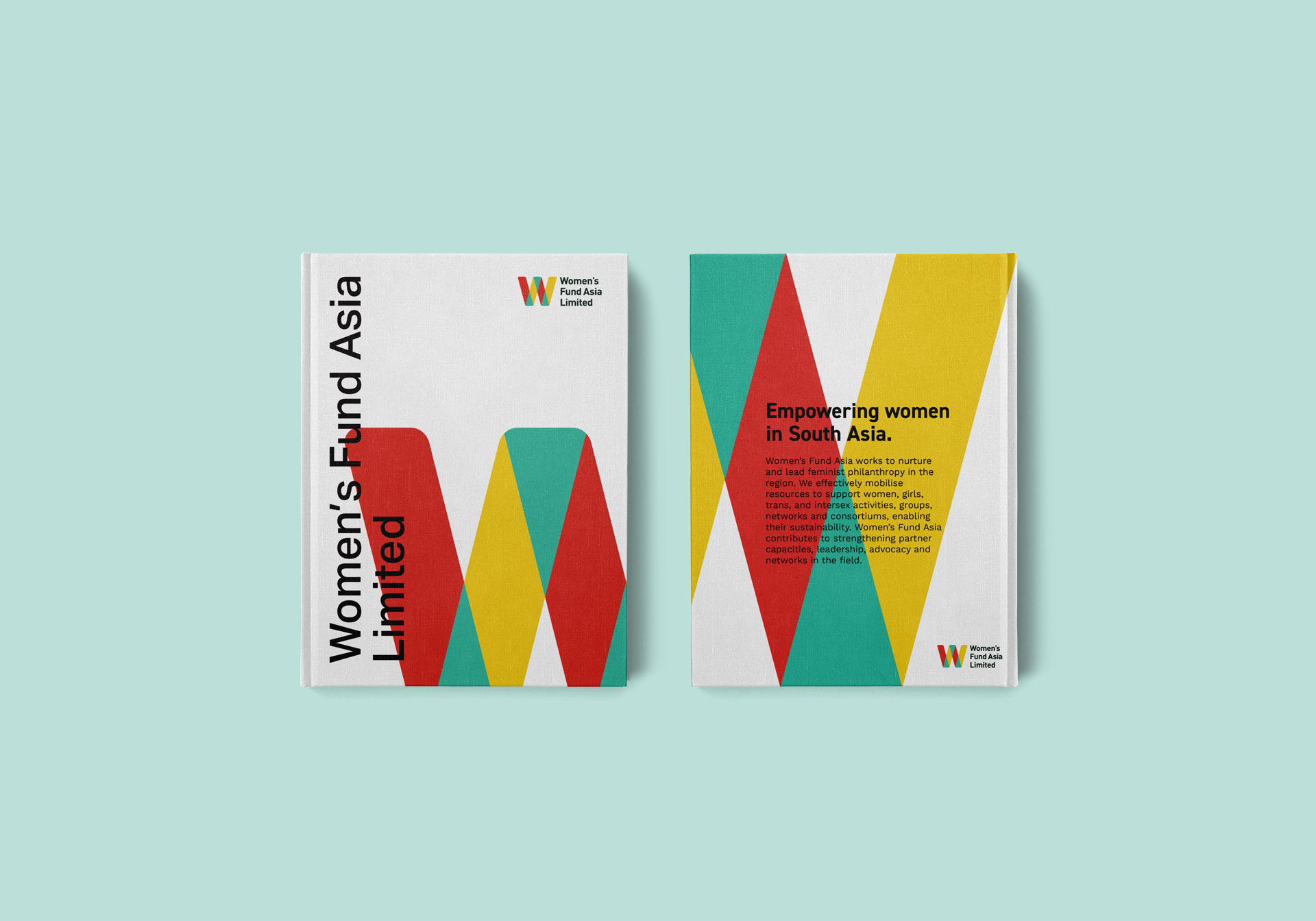
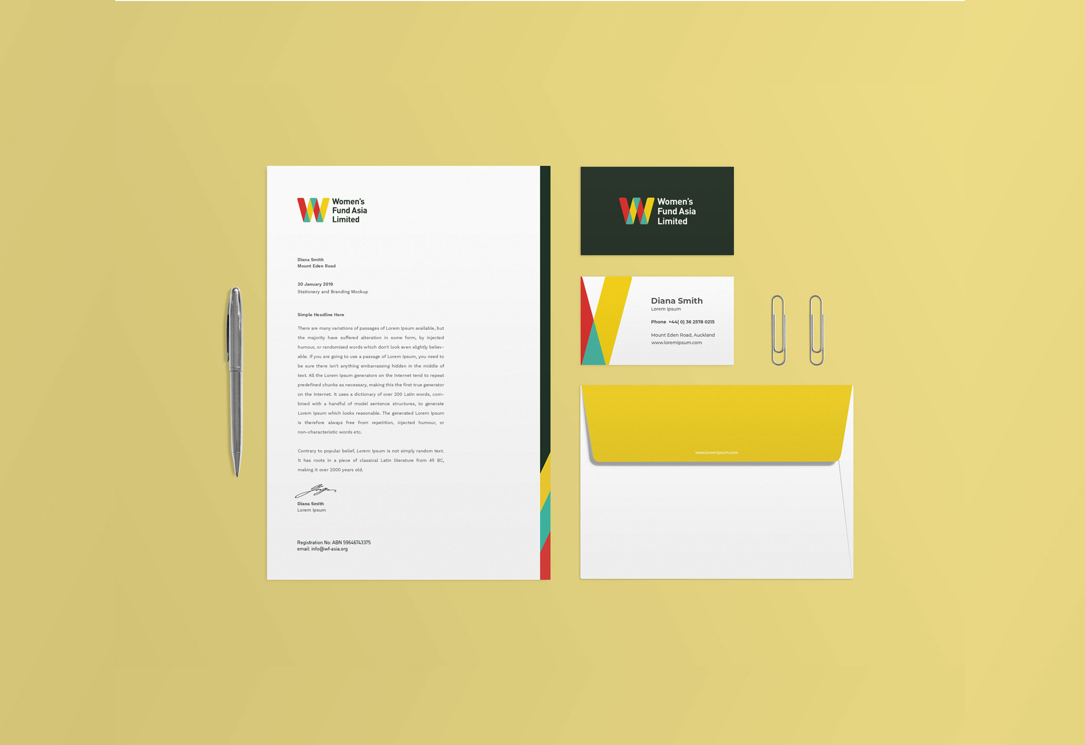
Client : Women’s Fund Asia Limited

WFAL: Branding

OVERVIEW

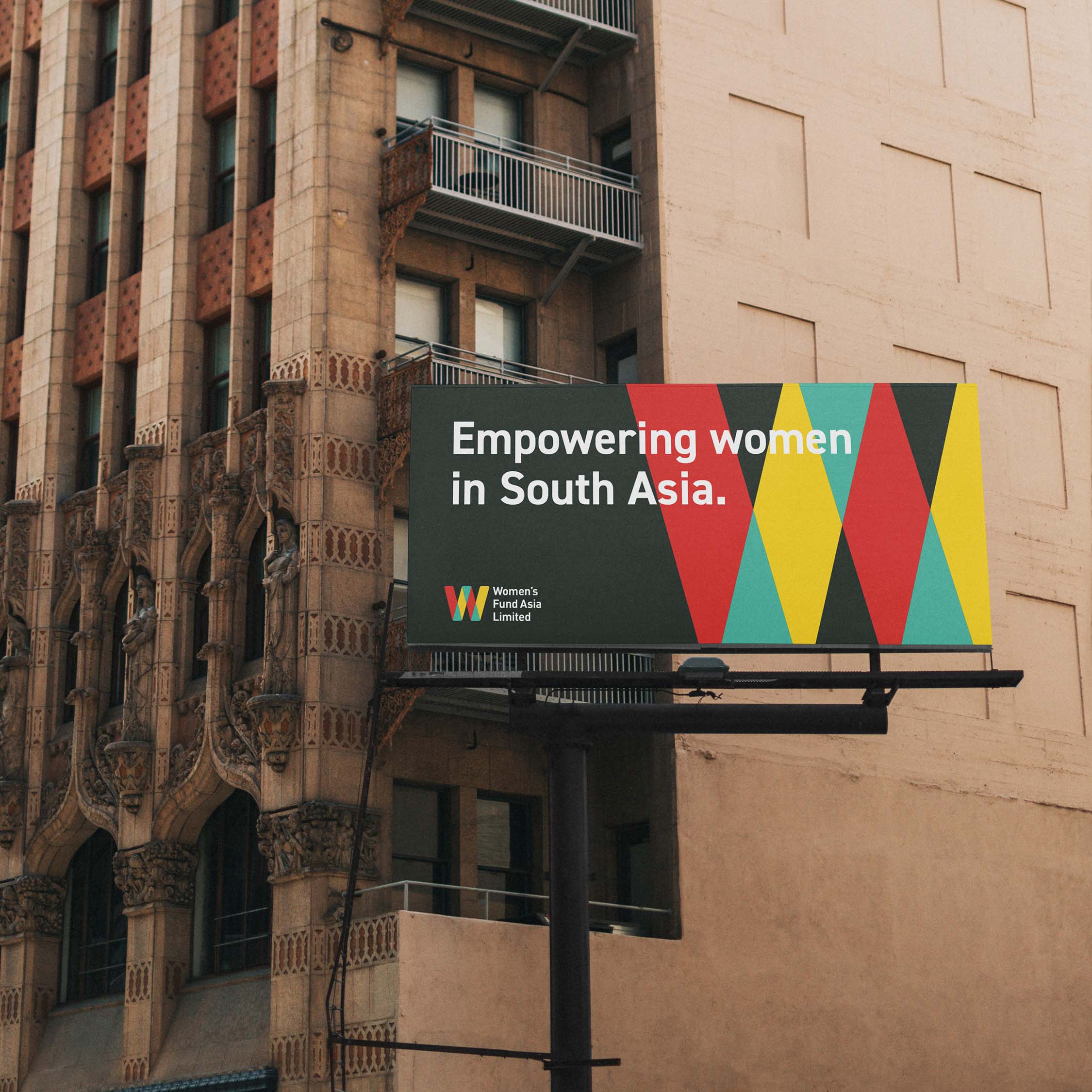
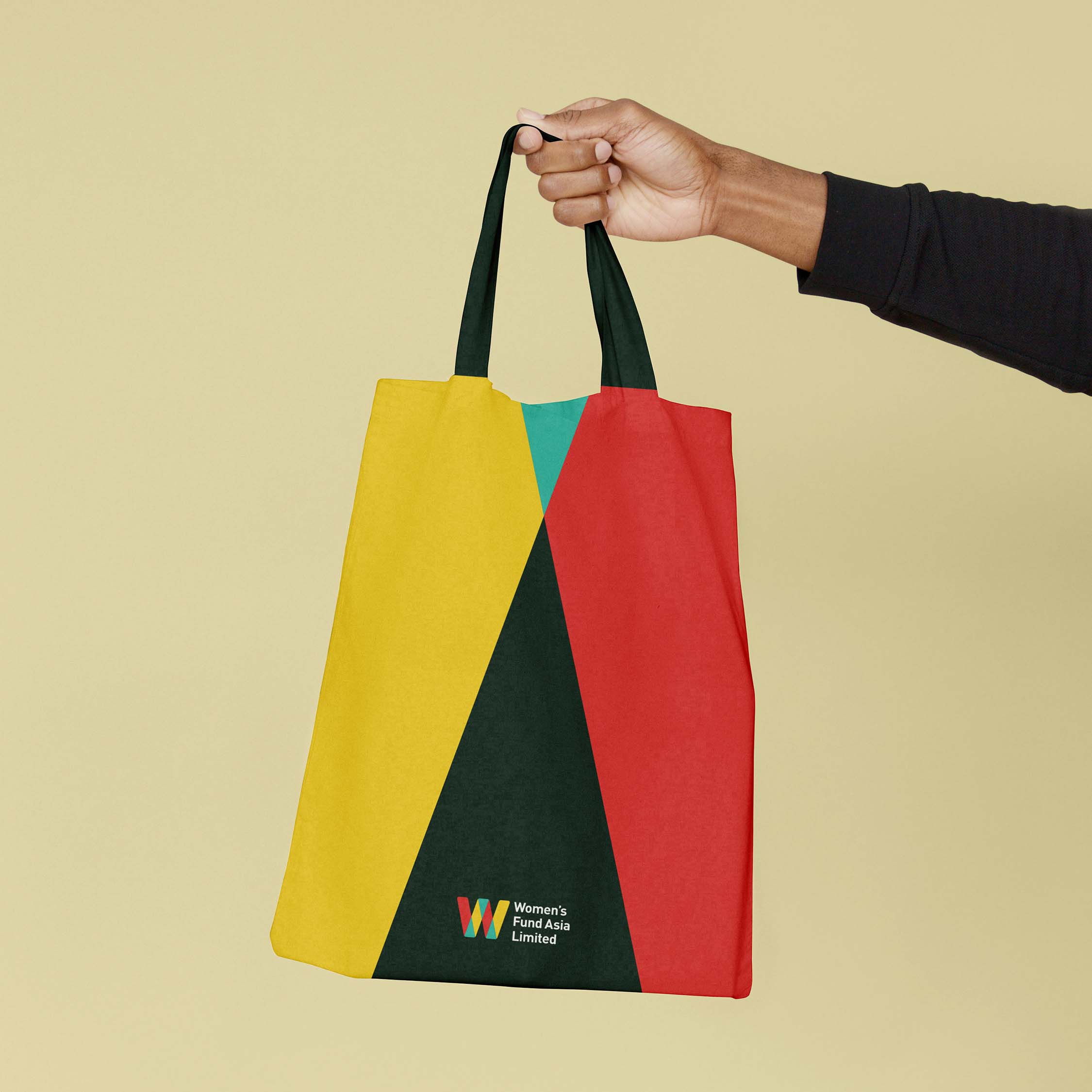
Women’s Fund Asia approached us to develop the branding for their subsidiary organisation, Women’s Fund Asia Limited. The logo needed to be similar to the original Women’s Fund Asia one while still being able to stand on its own feet.

OBJECTIVE

To create visually distinct branding for Women’s Fund Asia Limited by building on the foundations of the existing guidelines.

Highlighting Strength and Solidarity

Our biggest source of inspiration for the logo and visual language was the strength and solidarity in the work that WFAL does. The W is formed by the coming together of their four strong pillars: 1. Grant-making 2. Advocating, Influencing & Alliance Building for Resource Justice 3. Linking & Learning 4. Feminist Organisation Development. The intersection is where the magic happens. The solid blocks of colours and overlaps have directly evolved from WFA’s branding and the straight lines and triangle layer them with integrity.

Realness and Reliability

Clean, dependable type and a reduced colour palette were used to emphasise the reliability of the organisation. We included rounded corners to both the form and the typography to soften the logo and add an organic touch.

Viewed best on Portrait mode